A project built on Microsoft Fabric that brings the historical data of ten cryptocurrencies together from CSV files, Yahoo Finance and CoinGecko. The data is cleaned with Dataflow Gen2, stored in a Warehouse and presented in an interactive Power BI dashboard.
Tools: Microsoft Fabric (Lakehouse, Dataflow Gen2, Warehouse), Python, Power BI | View the project on GitHub
- 10 cryptocurrencies tracked
- 2020 to 2025 of price, volume and market capitalization history
- 4 data sources combined into one master table
The Scenario
The case study is a US-based fintech startup that is building a next-generation cryptocurrency intelligence and reporting platform. The objective was to enable effective monitoring by investors, traders and regulators. The project had four deliverables:
- Ingest historical and real-time data from multiple sources
- Clean and transform the data
- Store the data in a Warehouse and Eventhouse
- Visualize the insights with Power BI and real-time dashboards
This post covers the historical data pipeline. The real-time pipeline is a separate project: see it on GitHub.
The Ten Cryptocurrencies
| Currency | Symbol | Currency | Symbol |
|---|---|---|---|
| Aave | AAVE | Binance Coin | BNB |
| Cosmos | ATOM | Dogecoin | DOGE |
| Ethereum | ETH | Litecoin | LTC |
| NEM | XEM | Stellar | XLM |
| Uniswap | UNI | Wrapped Bitcoin | WBTC |
How the Project Works
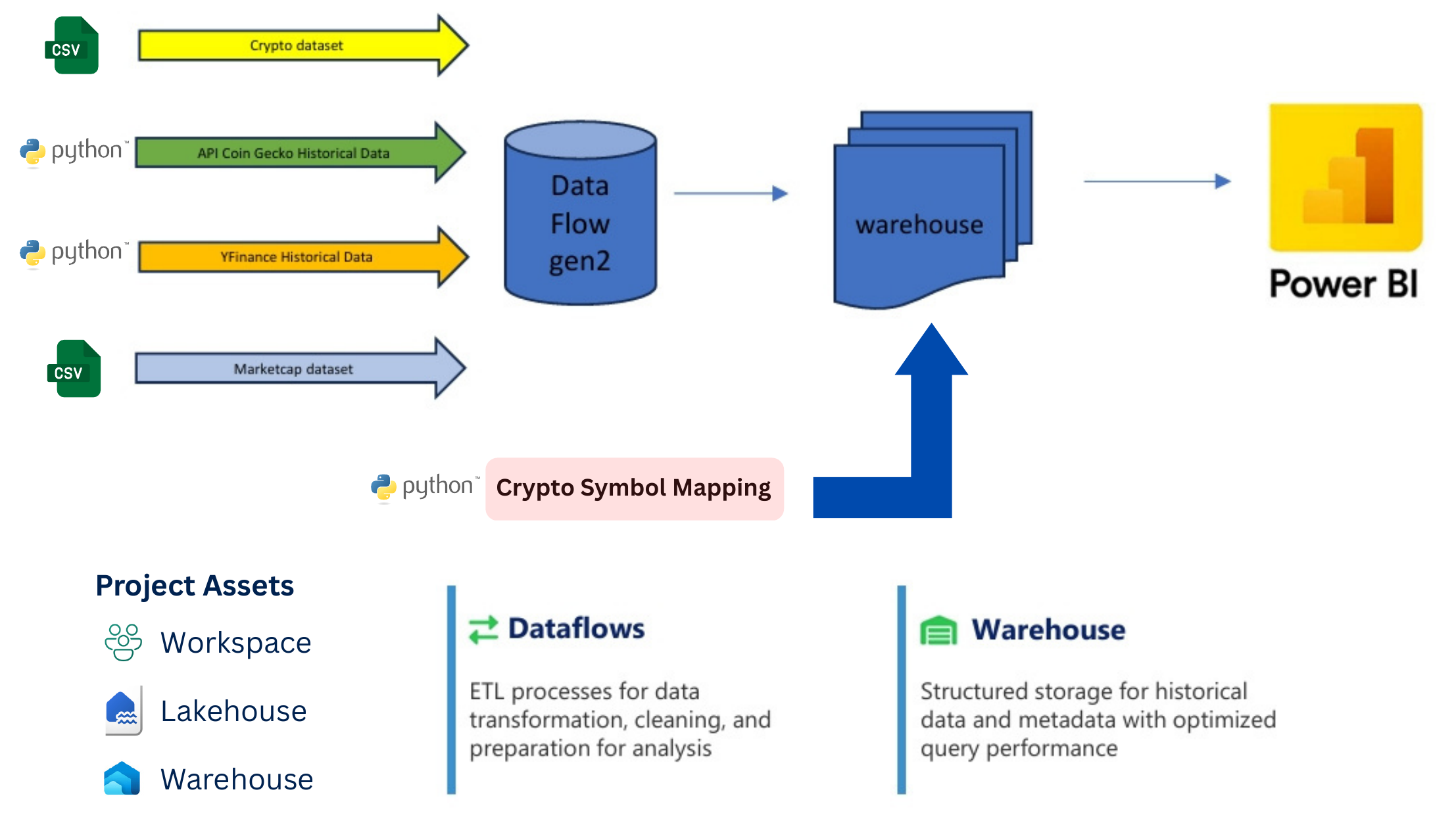
The project runs in one Microsoft Fabric workspace. Raw files land in a Lakehouse, Dataflow Gen2 cleans and combines them into a master table, and the table is loaded into a Warehouse. Power BI connects to the Warehouse for the dashboard.
The Data Sources
| Source | Period | How It Was Ingested |
|---|---|---|
| Historical CSV files | 2020 to 6 July 2021 | Ten CSV files, one per currency, loaded into the Lakehouse |
| Yahoo Finance | 21 July 2021 to June 2024 | Python notebook using the yfinance library |
| CoinGecko API | The last 365 days, ending 15 June 2025 | Python notebook calling the CoinGecko API |
| Market cap dataset | Provided with the project | CSV file loaded into the Lakehouse |
Data Ingestion With Python
Three Python notebooks run inside Fabric and write their results to the Lakehouse. The code below is trimmed to the important parts. The full notebooks are on GitHub.
Step 1: Yahoo Finance Historical Data
This notebook downloads daily prices for each currency between two dates and saves one CSV file per coin.
coin_tickers = { 'aave': 'AAVE-USD', 'binancecoin': 'BNB-USD', 'cosmos': 'ATOM-USD', 'dogecoin': 'DOGE-USD', 'ethereum': 'ETH-USD', 'litecoin': 'LTC-USD', 'nem': 'XEM-USD', 'stellar': 'XLM-USD', 'uniswap': 'UNI-USD', 'wrapped-bitcoin': 'WBTC-USD' } start_date = "2021-07-21" end_date = "2024-06-12" for coin_name, ticker in coin_tickers.items(): df = yf.download(ticker, start=start_date, end=end_date, interval="1d") if not df.empty: df.reset_index(inplace=True) df.insert(0, "Symbol", ticker) df.to_csv(f"{output_base}{ticker}.csv", index=False) # saved to the LakehouseStep 2: CoinGecko Historical Data
This notebook calls the CoinGecko API for each currency and collects daily price, market capitalization and trading volume. It pauses between requests to stay within the API's rate limit. The API key is kept out of the published code.
headers = { "accept": "application/json", "x-cg-demo-api-key": "YOUR_API_KEY" } market_url = "https://api.coingecko.com/api/v3/coins/{id}/market_chart" params = {"vs_currency": "usd", "days": "365", "interval": "daily"} for coin_id, symbol in coin_id_to_symbol.items(): time.sleep(1) # pause between requests to respect the API rate limit response = requests.get(market_url.format(id=coin_id), headers=headers, params=params) if response.status_code == 200: data = response.json() # build one record per day: price, market cap and trading volume ...Show the output
Fetching data for AAVE (aave)... Market data status: 200 Found 366 price points Successfully processed 366 records for AAVE ... Total records collected: 3660 Data shape: (3660, 9) Date range: 2024-06-16 to 2025-06-15 Cryptocurrencies: 10 Symbols: ['AAVE', 'BNB', 'ATOM', 'DOGE', 'ETH', 'LTC', 'XEM', 'XLM', 'UNI', 'WBTC']Step 3: Symbol Mapping
The price data identifies each currency by a code such as wrapped-bitcoin or XEM-USD. This notebook builds a small lookup table with the real name and symbol of each currency, so the dashboard shows names that anyone can read.
filtered = { "id": data.get("id"), "symbol": data.get("symbol", "").upper(), "name": data.get("name"), "yfinance_ticker": f"{data.get('symbol', '').upper()}-USD" } all_coin_data.append(filtered)Show the output
id symbol name yfinance_ticker aave AAVE Aave AAVE-USD binancecoin BNB BNB BNB-USD cosmos ATOM Cosmos Hub ATOM-USD dogecoin DOGE Dogecoin DOGE-USD ethereum ETH Ethereum ETH-USD litecoin LTC Litecoin LTC-USD nem XEM NEM XEM-USD stellar XLM Stellar XLM-USD uniswap UNI Uniswap UNI-USD wrapped-bitcoin WBTC Wrapped Bitcoin WBTC-USDData Transformation With Dataflow Gen2
All the files were loaded into Dataflow Gen2 in Power Query, where I and my teammates cleaned and combined them:
- Filtered the data from 2020 onwards
- Parsed dates and converted data types
- Standardized column names across all the sources
- Appended the CoinGecko data without creating duplicates
- Appended and joined everything into one historical master table
- Loaded the master table into the Warehouse
Challenges and Solutions
Integrating Several Sources
The CSV files, Yahoo Finance and CoinGecko all use different formats, column names and update frequencies. We solved this with a standardized schema for every source and transformation steps in Dataflow Gen2 that bring all the formats together.
Merging Without Duplicates
Combining historical data from several sources risks duplicate entries. We used date-based keys and merge strategies in Dataflow Gen2 to handle overlapping data points and keep the data consistent.
The Power BI Dashboard
The master table and the symbol mapping table were loaded into Power BI from Fabric, and a relationship between the two lets the dashboard show currency names. The dashboard includes:
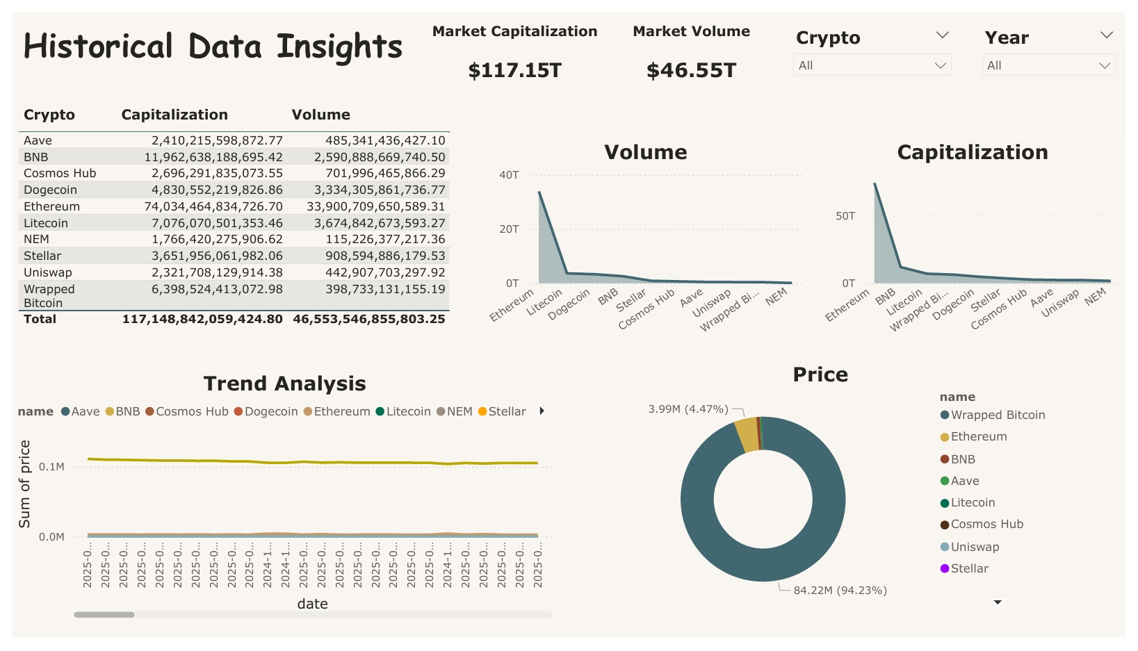
- Totals and a table by currency: market capitalization and trading volume for each of the ten currencies.
- Volume and capitalization charts: a side-by-side comparison of the currencies.
- Trend analysis: the price of each currency over time.
- Filters: the Crypto and Year drop-down filters narrow every visual to the currencies and years you choose.
How to read the totals: the market capitalization and volume figures add up the daily values across the whole period. They are cumulative totals, not the market's value on a single day.
What the Dashboard Shows
- Ethereum dominates: it accounts for about 63% of the combined market capitalization and about 73% of the combined trading volume.
- The next largest by market capitalization: BNB, Litecoin and Wrapped Bitcoin follow Ethereum.
- The most traded after Ethereum: Litecoin ($3.67T), Dogecoin ($3.33T) and BNB ($2.59T) in combined trading volume.
- The smallest: NEM has the lowest market capitalization and trading volume of the ten.